There have been hundreds, nay, thousands of kits to grace the Premier League since the league's inception in 1992-93. Some have been good, some have been bad, some have faded from memory and some have simply been so downright diabolical that they are likely to be forever emblazoned in the mind's eye.
When it comes to design choices, Premier League fans have seen it all. In the constant quest for fresh inspiration, clubs have dabbled in everything from stripes and hoops; sashes and checks; camouflage and psychedelia; right through to paisley and faux animal print.
It's fair to say that results have been decidedly varied over the past three decades, so with that in mind, here's our pick of the 10 very best and the 10 very worst football kits to ever see the light of the day in the English top flight, from 1992 right up to the present day.
BEST
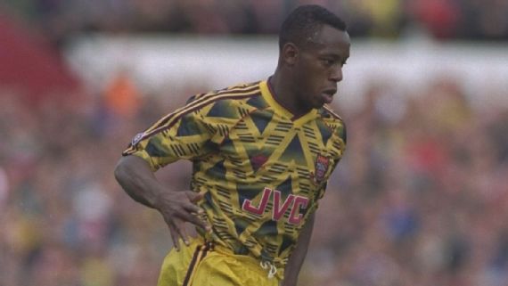
10. Arsenal: away, 1991-93 (Adidas)
Known affectionately as the "bruised banana" kit, Arsenal wore this on their travels in the two seasons that straddled the inception of the Premier League in the summer of 1992. The Gunners finished a mediocre 10th place in their maiden Premier League campaign, and they did so wearing a jersey that was a figure of fun for some at the time but has since become a beloved classic.
It still looks good to this day, and the inclusion of the old Adidas trefoil logo on the chest just adds a little extra dash of panache to the whole thing. Indeed, the only reason the beloved design is ranked so low here is that it only just overlaps into the Premier League era.
However, such is the enduring popularity of the bruised banana that the Gunners even dabbled with a re-skin (re-skin, banana kit, get it?) of the kit for their 2019-20 away shirt, which featured a modern interpretation of the angular yellow and blue graphic. The club even boast an entire section on their online store dedicated to the famous pattern, where fans can find swaddling retro jerseys, hot water bottles, Christmas jumpers and even items of furniture.
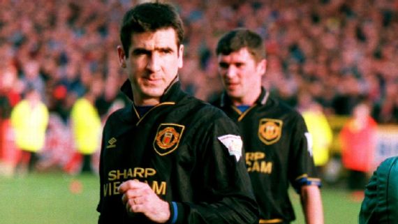
9. Manchester United: away, 1993-95 (Umbro)
The best black kit ever worn during the Premier League era came early on when United opted for this brooding aesthetic for the 1993-94 and 1994-95 seasons, with levels of menace akin to Darth Vader on one of his particularly grumpy days.
Much like the Dark Lord of the Sith, the strip will forever be associated with Eric Cantona's wild mood swings as it was the kit worn during the enigmatic Frenchman's infamous kung fu kick incident at Selhurst Park in January 1995 -- an act of assault that led to him being banned from all football activities for nine months.
Not that we condone that sort of spontaneous violence for a single second, but the United away kit of '93-95 is most definitely best worn with the collar turned up.
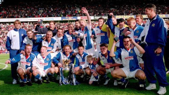
8. Blackburn Rovers: home, 1994-95 (Asics)
In nearly three decades of trying only seven different clubs have won the Premier League title, and Blackburn Rovers were the first upstarts to cause a shock long before Leicester City.
Propelled by the goals of Alan Shearer, Kenny Dalglish's effervescent Rovers side upset the apple cart to be crowned champions in 1994-95 and did so while wearing an incredibly handsome kit. In fact, their traditional blue-and-white half-and-half split design has arguably never looked better than the version Asics created for the club in the mid-1990s.
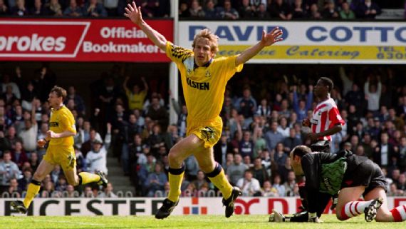
7. Tottenham Hotspur: away, 1991-94 (Umbro)
Another kit synonymous with a particular player, the mere thought of Tottenham's glorious yellow away kit from the early 1990s immediately conjures images of Jurgen Klinsmann, the flaxen-haired Germany international striker who set hearts aflutter in North London.
Electrifying the White Hart Lane faithful as he went with 29 goals in 50 games, Klinsmann formed a formidable partnership with Teddy Sheringham while wearing a succession of some of the most revered Spurs kits in the club's pantheon.
Unfortunately, Tottenham were unable to produce anything better than a seventh-place league finish while the yellow kit was in operation, though they did reach the FA Cup semifinals twice as well as the quarterfinals of the 1991-92 European Cup Winners' Cup before losing to Feyenoord over two legs.
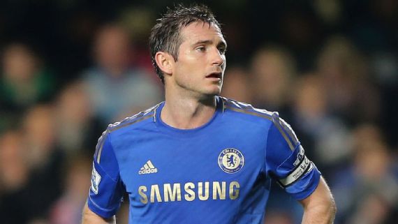
6. Chelsea: home, 2012-13 (Adidas)
Sometimes simplicity is the answer, and that's exactly the route Chelsea plumped for with the kit that followed their extraordinary voyage to victory in the 2011-12 Champions League.
Blue and gold; pared down and regal with a metallic-tinged club crest glistening under the right light -- a glorious yet understated strip befitting of the reigning European champions.
The golden trim was also supposed to reflect the exciting upcoming year of sport scheduled to take place in London in 2012 ahead of the Olympics, but we can only imagine that most Blues fans were too busy reliving Didier Drogba's 89th-minute equaliser against Bayern Munich at the Allianz Arena to be overly concerned with anything else.
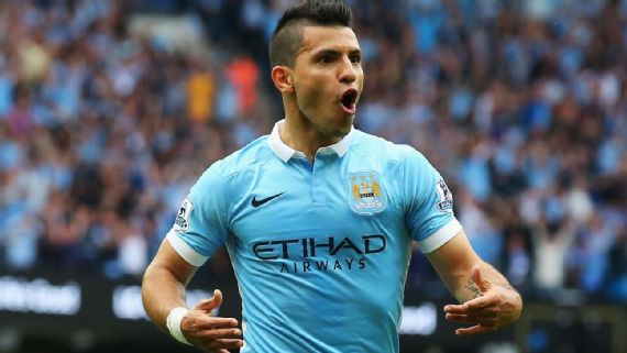
5. Manchester City: home, 2015-16 (Nike)
The perfect encapsulation of City's post-takeover makeover, the club's 2015-16 refined home shirt saw the return of white trim -- most notably the reintroduction of a contrasting polo collar, replacing the all-blue of the previous season.
The polo collar with concealed buttons was chosen as a visual reference to archetypal Mancunian street wear ("structured yet laid-back") as well as the attire synonymous with the city's legendary indie music scene.
Alas, the 2015-16 campaign didn't prove to be a vintage one for City, who finished fourth in the Premier League while getting themselves dumped out of the semifinals of the Champions League by Real Madrid. However, Manuel Pellegrini's side did at least manage to end the year with a little bit of silverware to show for their efforts after winning the League Cup final on penalties against Liverpool.
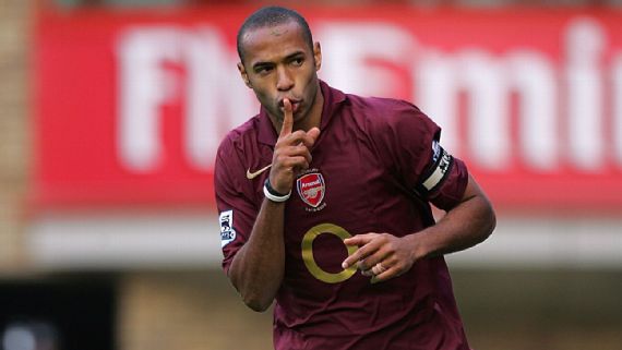
4. Arsenal: home, 2005-06 (Nike)
Ahead of their move down the road to the newly built Emirates Stadium, Arsenal bid a fond farewell to Highbury with a special home kit that saw them revert to the dark red shirts first worn by Woolwich Arsenal players upon the formation of the club in the late 19th century.
Originally a works team formed by staff at a munitions factory on the southern bank of the Thames, the nascent "Arsenal" didn't have the necessary funds to purchase a proper kit. As such, a number of players wrote to their former employers at Nottingham Forest to ask for donations. A set of mismatched dark red jerseys were sent, and it's largely agreed that Arsenal played in that slightly darker shade until legendary manager Herbert Chapman altered the hue to a brighter "pillar-box" red in 1935 while also introducing white sleeves into the mix to further distinguish his side from the multitude of other clubs playing in similar colours at the time.
So, in honour of those roots, the Gunners switched back to "redcurrant" and gold livery for their final hurrah at Highbury, ultimately finishing fourth in the Premier League and reaching the final of the Champions League only to lose 2-1 against Barcelona. If nothing else, Thierry Henry never looked better.
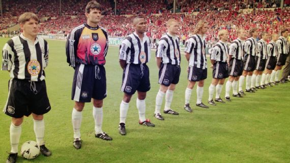
3. Newcastle United: home, 1995-97 (Adidas)
This kit is an enduring fan favourite and with good reason. Those black and white stripes have never looked as good as they did there and then, with the chunky "barcode" design coupled with a baggy fit and a floppy grandad collar to give a louche feel to a perfect jersey that couldn't exist in any other decade.
The shirt also saw a grand return for beloved local tipple Newcastle Brown Ale as principal sponsors, having previously been the first brand to appear on a Toon kit circa 1980. The sight of the famous blue star and beer mat marque in the centre of the design just added an irresistible extra dollop of "Geordie-ness."
The kit was sported by Newcastle's revered "great entertainers" side of Alan Shearer, David Ginola, Faustino Asprilla et al who came close to winning the Premier League title but fell just short to Manchester United both times. Just to top it all off, the accompanying goalkeeper kit, complete with a sunset silhouette of the Newcastle skyline, and the maroon-and-blue hooped away kit of 1995-96 are also both all-time top-flight classics in their own right.
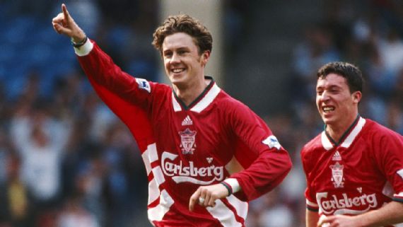
2. Liverpool: home, 1993-95 (Adidas)
Regardless of club allegiance, it's difficult to argue that this shirt is anything other than an exquisite example of the kit design art form. It looked great then and it still looks great now. This jersey also represents the last time the Reds had a home kit of anything other than, well, plain red -- barring the odd scattering of trim or piping.
The large, white three-pronged Adidas stripes first appeared on Liverpool's home shirt and shorts in 1991, and the design was then retained (while undergoing slight modification) in 1992-93 when Carlsberg replaced electrical retailers Candy as principle shirt sponsors.
The following year saw the stripes moved down from the shoulder to the lower midriff, with a seam of green teal (a colour synonymous with Liverpool thanks to the famous Liver Bird statues that are perched atop the city) added to the trim, including the oversized V-neck collar. The three stripes motif was also further replicated in the pattern woven into the fabric.
The club crest was also centralised for the first time. Indeed, a centrally aligned badge has featured on only three Liverpool home shirts to date: 1993-95, 2000-02 and 2002-04. The shirt also bears the traditional crest complete with the silhouette of the Anfield gates, ornate scrolls and eternal torches -- all of which were stripped away when the logo was streamlined in 2012.
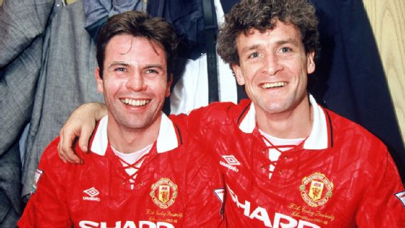
1. Manchester United: home, 1992-94 (Umbro)
In short, the perfect Premier League kit. It still looks crisp, clean and contemporary almost 30 years later. The word "timeless" is bandied around a lot when it comes to football shirts, but in the case of United's 1992-94 home attire, such plaudits are definitely deserved.
Every element of the jersey is immaculate: the glossy red material, the stylish MUFC pattern woven therein, the traditional club crest -- even the quirky lace-up collar, which has since become extinct in the world of kit design. The shirt is still revered and highly prized among United fans for being the one worn during the first two seasons of the Premier League, wherein their side claimed the title twice in succession. Indeed, United's league triumph in 1992-93 was their first in 26 years and duly proved the catalyst for a long and sustained period of domestic and European dominance under Sir Alex Ferguson.
It was the first United kit to be worn by club legend Cantona, who signed from Leeds United that summer. It was also the kit worn by Steve Bruce when he rammed home two late goals against Sheffield Wednesday in April 1993 to keep United's historic title tilt on track with a captain's performance before being bestowed with the honour of lifting the trophy just a few weeks later.
As well as being an undisputed era-defining masterpiece, the 1992-94 jersey was also the first in a golden run of classic home shirts for the club that was continued into 1994-96 by a similarly attractive sequel -- the "Theatre of Dreams" kit that featured a large watermark image of United's stadium sublimated into the fabric, which served as both an homage to their erstwhile home ground and a clever measure to ward off counterfeiters.
WORST
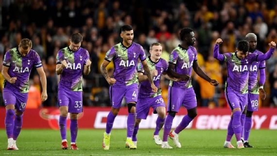
10. Tottenham: third, 2021-22 (Nike)
A truly gruesome, stomach-churning collision of putrid purple and sort of turnip-esque grey/green, splattered all over in shards of digitally manipulated patterns and textures. According to Nike, the shirt was designed as a tribute to all the young creative people working in the neighbourhood around Tottenham's stadium.
Quite what those budding young artists did to deserve such a glaring public snub is beyond us.
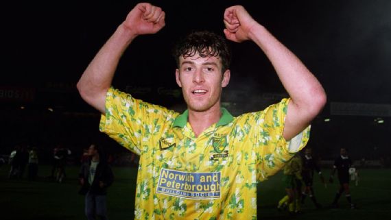
9. Norwich City: home, 1992-94 (Ribero/Mitre)
Kits splattered in abstract patterns were fairly commonplace in the early years of the Premier League era, so it's perhaps impressive that Norwich's home shirt of the era still manages to stand out from the crowd. It's even become something of an ironic cult classic in recent years.
That is likely because the Canaries' infamous "bird poo" kit was worn during a very successful period in the club's history, with Mike Walker's talented side achieving a best-ever top-flight finish (third) in the inaugural Premier League season, qualifying for the 1993-94 UEFA Cup as a result and then racking up famous victories over Vitesse Arnhem and Bayern Munich. It's just unfortunate that they were forced to dress like this for the duration.
The kit was originally manufactured by UK sportswear brand Ribero, which had the misfortune of going into receivership halfway through the 1993-94 season, which led Mitre to literally sew its logo over the top for the latter half of the campaign. Why anybody else would want to take credit for Ribero's risible design is another matter entirely.
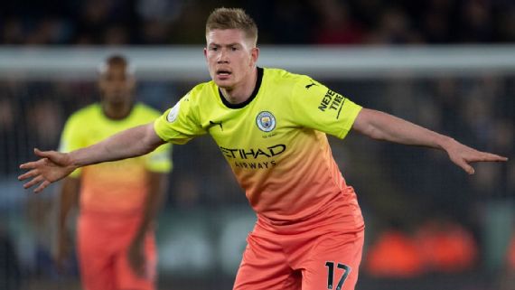
8. Manchester City: third, 2019-20 (Puma)
City lured us all into a false sense of security with their 2019-20 kit releases by kicking things off with a perfectly serviceable home kit and then a rather splendid throwback black away jersey inspired by the decor at Manchester's legendary Hacienda nightclub.
They then topped off the collection with a third jersey so aggressively bright it came perilously close to being phosphorescent. The jersey morphs from "fizzy yellow" at the top through to "Georgia peach" at the bottom and hence quickly became colloquially referred to as the "Tequila sunrise" kit.
Part of its first batch of City kits after replacing Nike as official suppliers, Puma insisted that the kit was supposed to reflect the attractive and dynamic attacking style of Pep Guardiola's side -- presumably by actually attacking all of your senses at once. Subtle it most certainly wasn't.
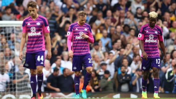
7. Sunderland: third, 2016-17 (Adidas)
If you've ever been kept awake through the wee small hours of the night wondering "how pink is too pink?" then Sunderland's 2016-17 third kit must have come as a blessed relief, providing as it did a conclusive answer to that particular query.
For everybody else, the strip arrived as an absolute eyesore; melding bright pink and dark violet hoops across the torso in a design that was made all the more taxing on the retinas by the frankly hostile addition of diagonal crosshatching.
Thankfully, the footballing gods were quick to mete out universal justice as the Black Cats finished rock bottom of the Premier League that season -- a fitting fate for a team dressed like this.
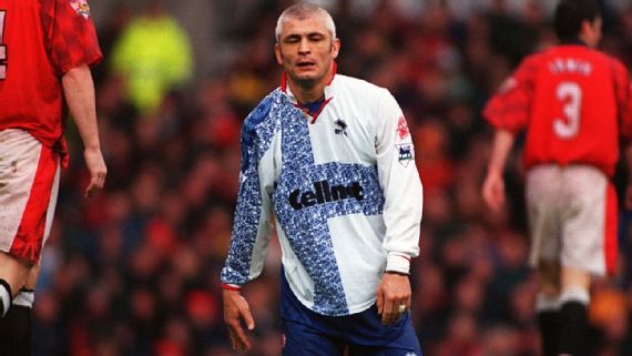
6. Middlesbrough: away, 1996-97 (Errea)
Middlesbrough enjoyed an impeccable run of lovely home kits in the 1990s, with pretty much every design from 1995-96 through to 1998-99 still fondly remembered by fans.
Alas, the same could not be said about the alternative strips of the same period, with a number of dreary blue-and-white away kits falling by the wayside in terms of cultural cachet. The nadir definitely came in 1996-97 (the year Boro were relegated from the Premier League despite reaching both domestic cup finals) when Errea went all out with a boxy white shirt besmirched by an equally oversized "crisscross" graphic.
The distorted blue cross had the look of a Magic Eye drawing, but when you squinted and looked closer, instead of a three-dimensional aeroplane or merry-go-round, the only thing conjured in your mind was an instant-onset migraine. All in all, a bit too busy.
5. Wolverhampton Wanderers: away, 2020-21 (Adidas)
Aimed for a younger demographic, Wolves roped in a number of local celebrities for the launch, including Grammy-nominated music producer S-X, UFC fighter Jai Herbert and a number of Wolverhampton-based skateboarders and snowboarders.
However, what might have been a perfectly pleasant universal white away shirt was utterly ruined by a massive mottled turquoise spillage all over the front panel that made it look like the jersey was made up of two random designs haphazardly stitched together.
The only saving grace is that the kit wasn't worn very often in 2020-21 (after all, how many other Premier League teams play in gold?) as Wolves fizzled to a 13th-place finish -- their lowest in three seasons -- shortly before popular manager Nuno Espirito Santos upped sticks and left the club.
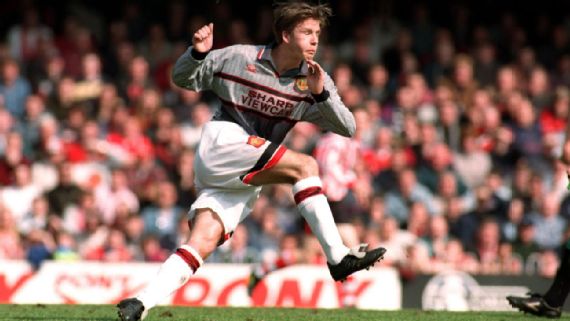
4. Manchester United: away, 1995-96 (Umbro)
An undisputed legend in the kit world. The infamous drizzle-grey kit caused Sir Alex Ferguson to suffer one of his most famous blown gaskets, this time during a fateful game against Southampton in April 1996.
Having found themselves flung from pillar to post in the opening half, Fergie's side were 3-0 down by the time they trudged into the changing rooms at The Dell at half-time. According to their manager, the sole reason for the shock scoreline was not that United had been woefully under par but that they had been sabotaged by their own kit -- the problem being that United's players couldn't see each other against the mottled backdrop of the crowd.
United subsequently changed into a fresh blue-and-white-striped third kit at the interval and promptly roared back to lose 3-1.
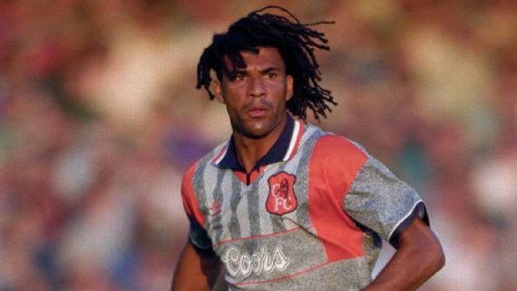
3. Chelsea: away, 1994-96 (Umbro)
Another mainstay in the rogue's gallery of abysmal football kits, Chelsea's garish grey-and-orange away kit of the mid-1990s has arguably aged a little better than initially expected -- though that's not to say that time has done anything to dampen the incredibly harsh colour clash on display.
It's said that the inclusion of bright orange was a stylistic flourish chosen to welcome Dutch icon Ruud Gullit to Stamford Bridge, though the patchwork of random design elements -- the odd half-apron of grey tonal stripes, the three-colour collar, the orange faux V-neck, the dayglo crests and badges -- all compete for attention while singularly failing to jell into anything remotely coherent.
The Blues finished 11th in the league in both seasons they wore their "grorange" (grey + orange) strip, though they did make it to the FA Cup semifinals and the final four of the UEFA Cup Winners' Cup during the 1995-96 campaign.
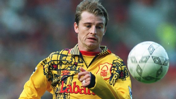
2. Nottingham Forest: away, 1995-97 (Umbro)
It's only fair that Nottingham Forest were banished from the English top flight for 23 years after the way they conducted themselves in the Premier League the last time round. We are of course referring to the infamously woeful away kit that sullied the world's richest league between the years 1995 and 1997.
Sickly yellow for starters, the shirt was then embellished with enormous grids of ugly graffiti made up of jumbled snippets of the two club crests -- the old coat of arms and the modern tree. The pin-striped collar just added more dissonance to an already chaotic design while the embroidered badge on the chest was big enough to eat your dinner off.
Being bright yellow, it also had the unforeseen side effect of attracting enormous clouds of little black flies throughout the summer months -- making playing football on the park while wearing a replica an absolute chore. Believe me.
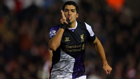
1. Liverpool: third, 2013-14 (Warrior)
Warrior lasted just three seasons as Liverpool's official kit supplier, and in that short time they managed to foist upon the club a concise cavalcade of utterly horrendous matchday attire.
While the home kits were largely of the benign "plain red" variety, the U.S.-based brand let loose when it came to the alternate uniforms with the 2012-13 third kit (purple with mock tribal tattoos on the sleeve) and 2013-14 away kit (white with a dizzying diamond print) setting the benchmark.
However, these were both easily surpassed by the 2013-14 third jersey, which must surely go down as the most vile piece of footballing apparel ever witnessed in the Premier League era (and quite possibly ever.)
Deafeningly loud, the shirt was split into three sections consisting of a plain black upper squatting above two lower bouts of jagged white and purple spikes. The upper sleeves then bore large asymmetrical patches of purple and white while the socks were also intentionally odd -- with the left leg featuring a black block and the right leg featuring a purple block.
The fact that Warrior also had the gall to claim that its nauseating design was directly inspired by the Reds' classic 1995-96 away kit (the handsome bottle green-and-white checkerboard strip worn in the 1996 FA Cup final) was just the ultimate insult.
Understandably, the 2013-14 third kit failed to find any favour among Liverpool fans and was almost immediately consigned to the garbage heap of history, chiefly because it still looks like three or four different design concepts mashed together in a waste disposal unit. Best place for it.


