

We all love Netflix, that's why it's basically killed broadcast TV, but let's not beat around the bush: it can be an absolute mess to navigate.
The TV app in particular just throws categories at you randomly with no apparent rhyme or reason. Sure, the 'Continue Watching' strip is at the top, but sometimes we've had to scroll down through some really obscure stuff to get our personally-curated list of things we want to watch (Pokémon, essentially).
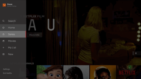
Well, rejoice, fans of Netflix on your TV. The streaming giant has unveiled a new redesign for the TV apps, and it's a welcome change.
© Netflix
Similar to the YouTube apps on TV, there is now a sidebar to the left that allows you to quickly access the search function, your list, new additions to the service and separate categories for movies and TV shows.
In a blog post, Director of Product Innovation Stephen Garcia said: "Our research has shown us that while a member generally isn't sure what exact title they want to watch, they have a pretty good sense of whether they are in the mood for a quick series episode or a longer movie experience.

© Netflix
"While this may feel like an obvious update to some, validating that this TV experience was better for our members took extensive research, testing and technology improvements."
The TV app update began rolling out yesterday (July 18).